South America Tweets Visualization
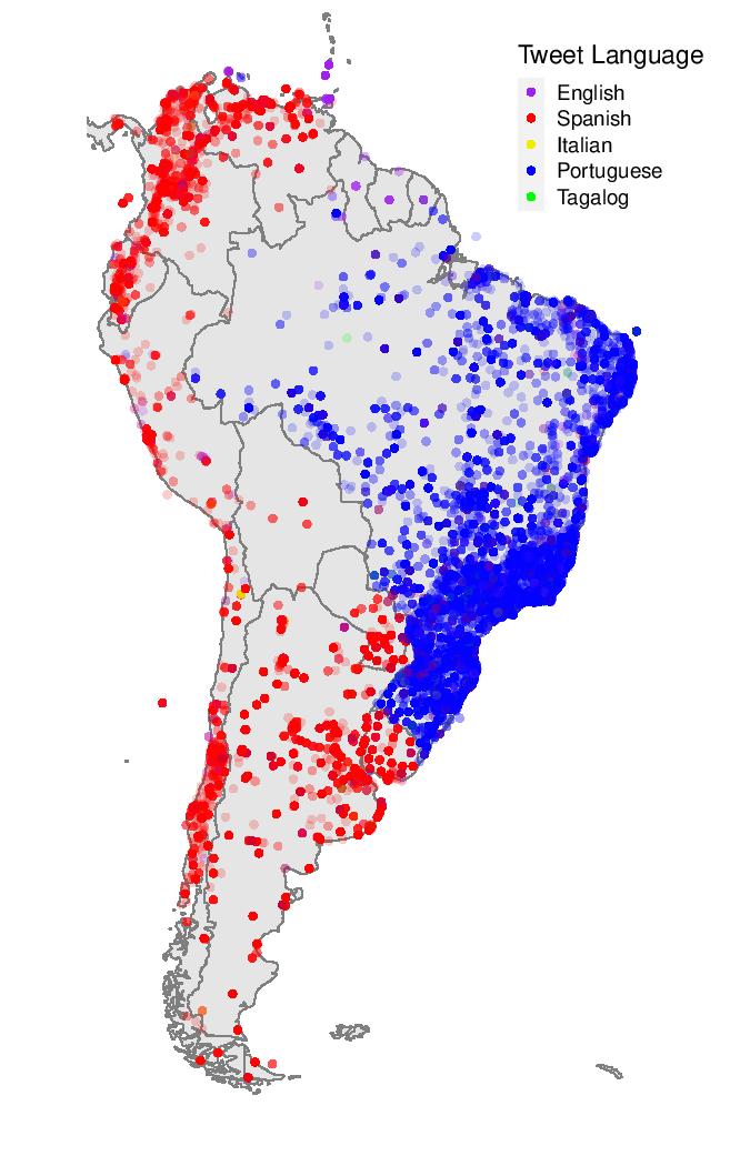
For this project, I used Twitter data to analyze language use in Tweets across South America. I streamed tweets for over 10 hours using the “rtweet” package and the Twitter API, restricting my stream to the geographic coordinates of South America. The “ggplot2” and “maps” packages helped me construct this visualization from the streamed Twitter data.
Highlights
The map visualization is interesting for a few reasons. First of all, it demonstrates the usefulness of the Twitter language data. This data required some cleaning but the clear division between Spanish and Portuguese Tweets along the Brazil border, for example, lends some validation to the accuracy of this data and the visualization method.
For the most part the languages are distributed as might be expected. The occasional Italian tweets in Chile and Argentina were somewhat surprising to me, as were the few Tagalog tweets in Brazil.
The visualization also gives some insight into where South American tweeters are most often located – or at least where they were tweeting from most often when I was streaming. There is certainly some correlation between where people tweet most and where most people live, but an interesting extension of this exploration might be to compare this kind of visualization with a population density one. This could uncover discrepancies in Twitter usage across countries, regions, and languages.
References
Some ideas and code were borrowed from Friedrich Geiecke (Assistant Professor, The London School of Economics and Political Science).
Graphics were created using R. Code on Github.
